Robert J. Butler profile photo

Senior UI/UX Designer & Product Design Specialist

Robert J. Butler

Focused on

I design scalable enterprise experiences that balance user needs, business goals, accessibility, and engineering realities. Over 15+ years, I’ve helped organizations like Google, AT&T, DIRECTV, and Cox transform complex systems into intuitive, measurable digital products.
About Me

I’m a research-driven Senior UI/UX Designer and product-minded technologist with deep experience across enterprise platforms, responsive web, native mobile, internal tools, and design systems. My work sits at the intersection of user research, stakeholder alignment, interaction design, visual systems, accessibility, and implementation partnership.

I've worked across large organizations and complex ecosystems, translating ambiguity into clear product direction, usable workflows, and scalable interface patterns. My strongest work happens when I can connect discovery, strategy, design execution, validation, and delivery into one clear story that moves teams forward.

Robert J. Butler
Senior UI/UX Designer & Product Strategist
Celina / Dallas-Fort Worth, Texas

Core Strengths

User Research
Journey Mapping
Design Systems
Responsive Product Design
Accessibility
Developer Partnership

Selected Case Studies

A clearer look at how I approach discovery, definition, ideation, design validation, delivery, and measurable outcomes.

Case Study: Adaptive AI Energy

AI Product Design / Adaptive Experience / Visual Systems / Physical-Digital Interaction

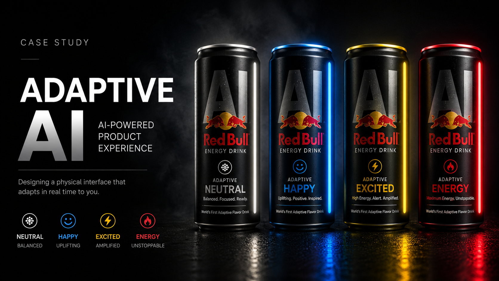
Adaptive AI Energy can system showing Neutral, Happy, Excited and Energy states

Adaptive AI Energy is a speculative product design concept exploring how artificial intelligence can become a visible and understandable part of a physical product experience. The concept uses a consistent industrial design while allowing the product's emotional state, illumination, language and visual feedback to adapt dynamically.

AI Product Concept

The core concept transforms AI from an invisible technical capability into a visible product behavior. Rather than exposing users to technical system terminology, the experience communicates change through familiar visual and emotional signals.

AI Monogram

An oversized metallic AI monogram acts as the primary identifier across the entire product family. The mark remains consistent across every adaptive state, creating a strong and recognizable visual anchor.

LED State Strip

A single illuminated edge provides immediate visual feedback about the product's current state. The LED becomes a lightweight physical interface that communicates system behavior without requiring a traditional display.

Human-Centered Mood Naming

Neutral, Happy, Excited and Energy translate adaptive behavior into plain-language states that users can immediately understand. The system removes technical complexity and communicates behavior in human terms.

Color Semantics

Color provides a secondary layer of meaning across the system. White represents Neutral, blue represents Happy, yellow represents Excited, and red represents Energy.

Adaptive Design System

The visual system separates permanent brand elements from adaptive interface elements. The black can, AI mark and core branding remain stable while LED color, iconography and mood language change.

NEUTRAL

Balanced.
Focused.
Ready.

HAPPY

Uplifting.
Positive.
Inspired.

EXCITED

Alert.
Amplified.
High Energy.

ENERGY

Maximum Energy.
Driven.
Unstoppable.

Product Design Story

The visual language separates the permanent brand layer from the adaptive experience layer. The black product form, AI mark and core branding stay stable, while LED color, iconography and mood language change. This creates recognition, system consistency and an immediate feedback loop between AI behavior and the user experience.

View Adaptive AI Product Design PDF

Case Study: AT&T Global Navigation System

Enterprise UX, design systems, navigation strategy, stakeholder alignment, and implementation support.

Discovery & Research

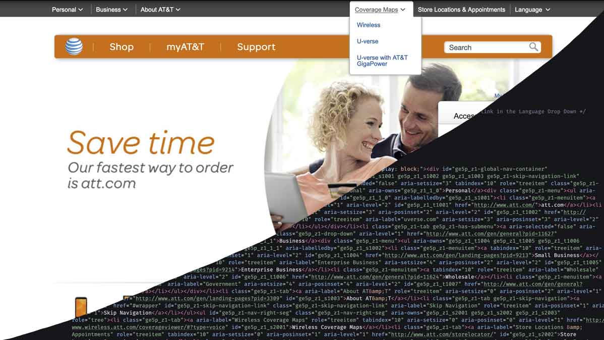
Partnered with product, business, and technology stakeholders to understand navigation inconsistencies, access-control needs, content ownership, and user workflow friction across a complex enterprise ecosystem.

Define

Framed the problem around consistency, scalability, governance, and user confidence. Defined requirements for a reusable global navigation pattern that could support multiple business properties and teams.

Ideation

Explored navigation models, layout patterns, hierarchy, access states, and interaction behavior through wireframes, design rationale, and cross-functional review.

Design & Validation

Created high-fidelity interaction patterns and prototypes, reviewed usability concerns with stakeholders, and iterated toward a scalable system that balanced user clarity with enterprise constraints.

Delivery & Outcomes

Supported development handoff, implementation alignment, and UI consistency across multiple properties. The work helped establish a more reliable navigation experience and stronger system governance.

Ownership

Owned UX analysis, wireframing, interface direction, prototype support, stakeholder communication, and front-end partnership through delivery.

View Supporting Portfolio PDF

Additional Case Study Snapshots

Supporting examples that show product thinking, interface design, prototyping, and development range.

RJBDallas Portfolio Redesign

Reframed the portfolio from a visual gallery into a UX case-study experience that better communicates process, ownership, business context, and senior-level product thinking.

Healthcare App Concept

Designed mobile-first wireframes focused on symptom entry, user guidance, task clarity, and reducing friction in a sensitive healthcare interaction.

View Figma

Enterprise Dashboard Concept

Created a dashboard concept with light and dark themes, admin workflows, modular widgets, and scalable information hierarchy for enterprise users.

View Figma

Krypto Trading Platform Concept

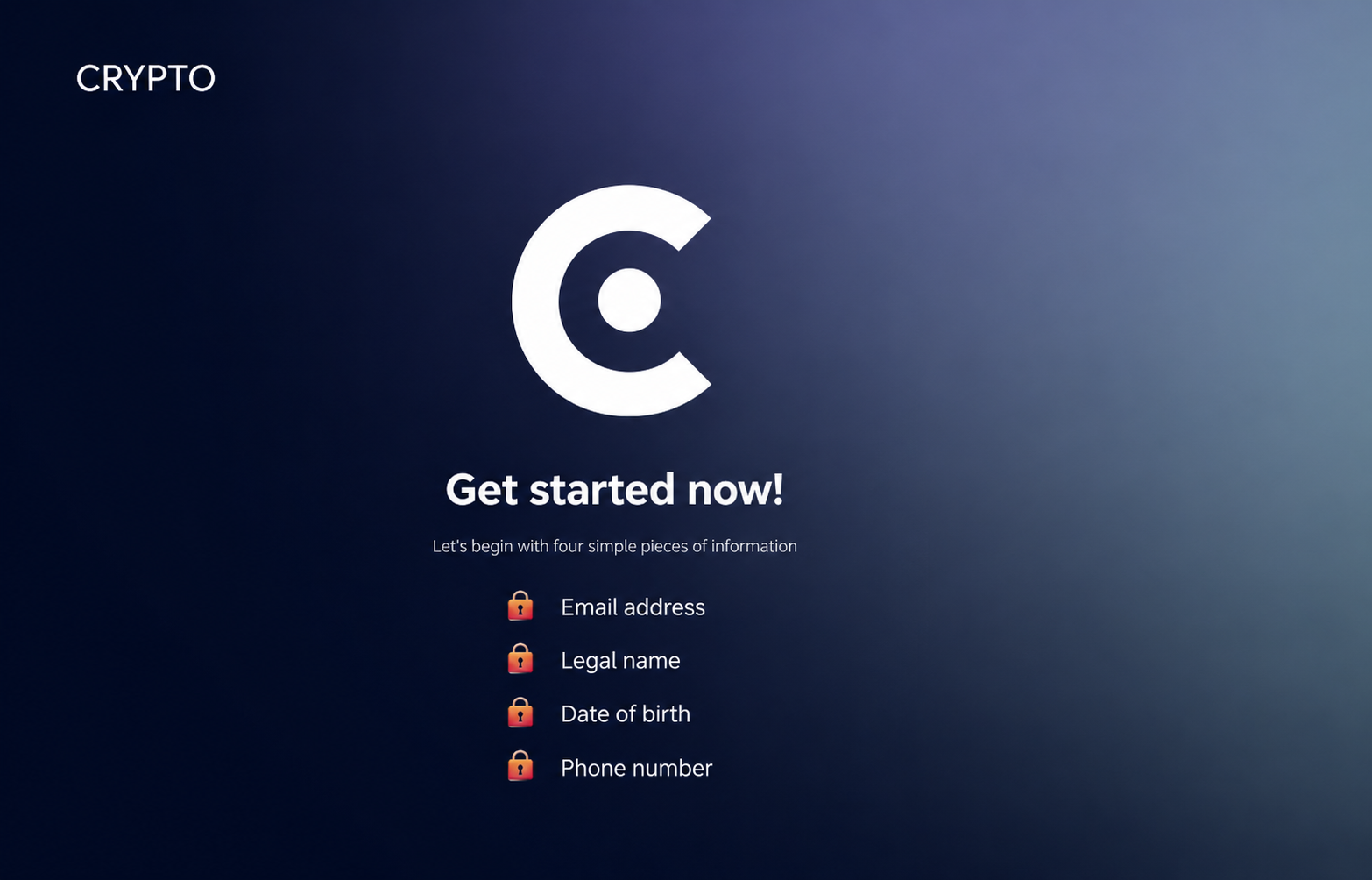
Designed a modern crypto-focused landing experience centered around trust, clarity, visual hierarchy, and conversion-focused product storytelling. The concept explored responsive layout systems, financial UI patterns, dashboard-inspired components, and modern fintech interaction design.

View Figma

Fit Fight Website

Developed a visual web concept with strong brand energy, responsive layout thinking, and clear conversion paths for a fitness-focused experience.

View Figma

UX Process

1. Discovery & Research

I start by understanding users, business goals, technical constraints, and stakeholder expectations. This includes user research, stakeholder interviews, product audits, analytics review, and problem discovery.

2. Define

I synthesize findings into clear problem statements, user needs, personas, journey maps, task flows, requirements, and prioritization frameworks.

3. Ideation

I explore multiple solution paths through sketches, wireframes, design workshops, information architecture, and rationale-driven concept development.

4. Design & Validation

I create high-fidelity designs, prototypes, component patterns, and interaction models. I validate decisions through usability testing, stakeholder feedback, accessibility checks, and iterative refinement.

5. Delivery & Outcomes

I partner closely with engineering through handoff, design QA, implementation support, and design system documentation. I measure success through adoption, usability improvements, conversion, efficiency, and lessons learned.

Ownership

I'm comfortable owning the full UX lifecycle or stepping into a focused role across research, product strategy, design systems, interaction design, prototyping, validation, or delivery.

Capabilities

Practical skills I use to move digital products from ambiguity to delivery.

Research & Strategy

User interviews, stakeholder workshops, journey maps, competitive audits, discovery synthesis, product framing, and roadmap influence.

Product Design

Responsive web, native mobile, dashboards, internal tools, workflow design, prototyping, information architecture, and interaction design.

Design Systems

Reusable components, Figma libraries, design tokens, accessibility patterns, documentation, governance, and design-to-development alignment.

Accessibility

Inclusive design, responsive behavior, contrast checks, keyboard-aware experiences, semantic structure, and WCAG-informed decisions.

Technical Collaboration

Developer handoff, front-end awareness, HTML/CSS/JS familiarity, React collaboration, design QA, and implementation support.

Measurement

Usability improvements, conversion paths, efficiency gains, behavioral analytics, adoption signals, qualitative learnings, and product outcomes.

Contact

Let’s talk about product design, UX strategy, or your next digital experience.